Following my introduction to PCA, I will demonstrate how to apply and visualize PCA in R. There are many packages and functions that can apply PCA in R. In this post I will use the function prcomp from the stats package. I will also show how to visualize PCA in R using Base R graphics. However, my favorite visualization function for PCA is ggbiplot, which is implemented by Vince Q. Vu and available on github. Please, let me know if you have better ways to visualize PCA in R.
Computing the Principal Components (PC)
I will use the classical iris dataset for the demonstration. The data contain four continuous variables which corresponds to physical measures of flowers and a categorical variable describing the flowers’ species.
# Load data
data(iris)
head(iris, 3)

  Sepal.Length Sepal.Width Petal.Length Petal.Width Species
1          5.1         3.5          1.4         0.2  setosa
2          4.9         3.0          1.4         0.2  setosa
3          4.7         3.2          1.3         0.2  setosa
We will apply PCA to the four continuous variables and use the categorical variable to visualize the PCs later. Notice that in the following code we apply a log transformation to the continuous variables as suggested by [1] and set center and scale. equal to TRUE in the call to prcomp to standardize the variables prior to the application of PCA:
# log transform
log.ir <- log(iris[, 1:4])
ir.species <- iris[, 5]

# apply PCA - scale. = TRUE is highly
# advisable, but default is FALSE.
ir.pca <- prcomp(log.ir,
                 center = TRUE,
                 scale. = TRUE)
Since skewness and the magnitude of the variables influence the resulting PCs, it is good practice to apply skewness transformation, center and scale the variables prior to the application of PCA. In the example above, we applied a log transformation to the variables but we could have been more general and applied a Box and Cox transformation [2]. See at the end of this post how to perform all those transformations and then apply PCA with only one call to the preProcess function of the caret package.
Analyzing the results
The prcomp function returns an object of class prcomp, which have some methods available. The print method returns the standard deviation of each of the four PCs, and their rotation (or loadings), which are the coefficients of the linear combinations of the continuous variables.
# print method
print(ir.pca)

Standard deviations:
[1] 1.7124583 0.9523797 0.3647029 0.1656840

Rotation:
                    PC1         PC2        PC3         PC4
Sepal.Length  0.5038236 -0.45499872  0.7088547  0.19147575
Sepal.Width  -0.3023682 -0.88914419 -0.3311628 -0.09125405
Petal.Length  0.5767881 -0.03378802 -0.2192793 -0.78618732
Petal.Width   0.5674952 -0.03545628 -0.5829003  0.58044745
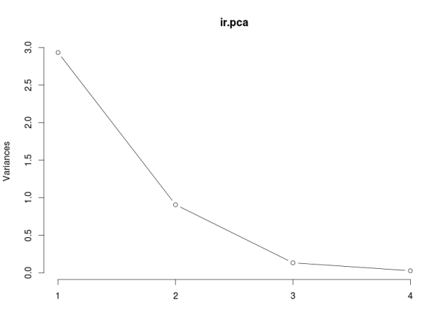
The plot method returns a plot of the variances (y-axis) associated with the PCs (x-axis). The Figure below is useful to decide how many PCs to retain for further analysis. In this simple case with only 4 PCs this is not a hard task and we can see that the first two PCs explain most of the variability in the data.
# plot method
plot(ir.pca, type = "l")
The summary method describe the importance of the PCs. The first row describe again the standard deviation associated with each PC. The second row shows the proportion of the variance in the data explained by each component while the third row describe the cumulative proportion of explained variance. We can see there that the first two PCs accounts for more than 
# summary method
summary(ir.pca)

Importance of components:
                          PC1    PC2     PC3     PC4
Standard deviation     1.7125 0.9524 0.36470 0.16568
Proportion of Variance 0.7331 0.2268 0.03325 0.00686
Cumulative Proportion  0.7331 0.9599 0.99314 1.00000
We can use the predict function if we observe new data and want to predict their PCs values. Just for illustration pretend the last two rows of the iris data has just arrived and we want to see what is their PCs values:
# Predict PCs
predict(ir.pca,
        newdata=tail(log.ir, 2))

          PC1         PC2        PC3         PC4
149 1.0809930 -1.01155751 -0.7082289 -0.06811063
150 0.9712116 -0.06158655 -0.5008674 -0.12411524
The Figure below is a biplot generated by the function ggbiplot of the ggbiplot package available on github.
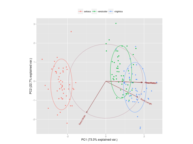
The code to generate this Figure is given by
library(devtools)
install_github("ggbiplot", "vqv")

library(ggbiplot)
g <- ggbiplot(ir.pca, obs.scale = 1, var.scale = 1,
              groups = ir.species, ellipse = TRUE,
              circle = TRUE)
g <- g + scale_color_discrete(name = '')
g <- g + theme(legend.direction = 'horizontal',
               legend.position = 'top')
print(g)
It projects the data on the first two PCs. Other PCs can be chosen through the argument choices of the function. It colors each point according to the flowers’ species and draws a Normal contour line with ellipse.prob probability (default to 
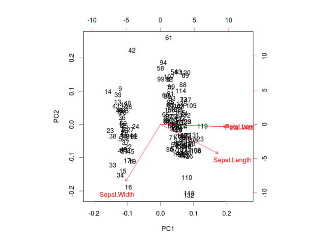
ggbiplot can be obtained by the usual ?ggbiplot. I think you will agree that the plot produced by ggbiplot is much better than the one produced by biplot(ir.pca) (Figure below).
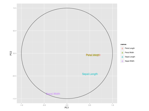
I also like to plot each variables coefficients inside a unit circle to get insight on a possible interpretation for PCs. Figure 4 was generated by this code available on gist.
PCA on caret package
As I mentioned before, it is possible to first apply a Box-Cox transformation to correct for skewness, center and scale each variable and then apply PCA in one call to the preProcess function of the caret package.
require(caret)
trans = preProcess(iris[,1:4],
                   method=c("BoxCox", "center",
                            "scale", "pca"))
PC = predict(trans, iris[,1:4])
By default, the function keeps only the PCs that are necessary to explain at least 95% of the variability in the data, but this can be changed through the argument thresh.
# Retained PCs
head(PC, 3)

        PC1        PC2
1 -2.303540 -0.4748260
2 -2.151310  0.6482903
3 -2.461341  0.3463921

# Loadings
trans$rotation

                    PC1         PC2
Sepal.Length  0.5202351 -0.38632246
Sepal.Width  -0.2720448 -0.92031253
Petal.Length  0.5775402 -0.04885509
Petal.Width   0.5672693 -0.03732262
See Unsupervised data pre-processing for predictive modeling for an introduction of the preProcess function.
References:
[1] Venables, W. N., Brian D. R. Modern applied statistics with S-PLUS. Springer-verlag. (Section 11.1)
[2] Box, G. and Cox, D. (1964). An analysis of transformations. Journal of the Royal Statistical Society. Series B (Methodological) 211-252
 observations of
  different variables. Define
  to be a
  matrix where the
  -th column of
  . Each row
  of
of  -dimensional sub-space
  in a way that minimizes the residual sum of squares (RSS) of the projection. That is, it minimizes the sum of squared distances from the points to their projections. It turns out that this is equivalent to maximizing the covariance matrix (both in trace and determinant) of the projected data (
 to be the covariance matrix associated with
 is a diagonal matrix of (non-negative) eigenvalues in decreasing order, and
  is a matrix where its columns are formed by the eigenvectors of
  to be a linear combination of the columns of
  , subject to
  . In addition, we want
 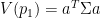 . It turns out that
  will be given by the column eigenvector corresponding with the largest eigenvalue of
  in this context to be the fraction of the original variance kept by the projected points,
 versus the number of components can be useful to visualize the number of principal components that retain most of the variability contained in the original data.

